Brand
Manual
The appearance of the Loxone Campus is a clear statement of clarity, functionality and design. To ensure a consistent brand experience across all channels and markets, please adhere strictly to the following guidelines.
If you have any questions about these guidelines, please contact:
marketing@loxone-campus.com
Logo
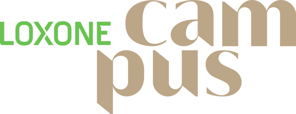
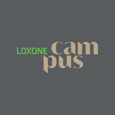
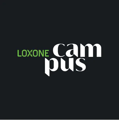
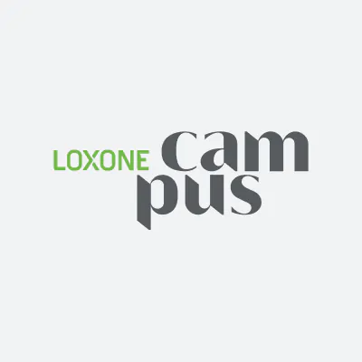
Some examples of the use of colors on light and dark backgrounds
Important: Always ensure there is good contrast between the logo and the background.
Colors

Oak Tree
CMYK C
25 | 30 | 45 | 10
RAL 1001
Beige
Screen
sRGB (Web)
188 | 167 | 138
HEX
#BCA78A

Shadow
CMYK C
00 | 16 | 40 | 50
RAL 1036
Perlgold
Screen
sRGB (Web)
128 | 107 | 77
HEX
#806B4D

Mantis Green
CMYK C
60 | 00 | 85 | 00
RAL 6018
Gelbgrün
Screen
sRGB (Web)
105 | 195 | 80
HEX
#69C350

Oak Tree
CMYK C
46 | 00 | 59 | 52
RAL 6017
May green
Screen
sRGB (Web)
67 | 123 | 51
HEX
#437b33

Davys Grey
CMYK C
09 | 04 | 00 | 63
RAL 7011
Iron grey
Screen
sRGB (Web)
86 | 91 | 95
HEX
#565B5F

Oak Tree
CMYK C
31 | 16 | 00 | 87
RAL 5004
Blackblue
Screen
sRGB (Web)
22 | 27 | 32
HEX
#161B20
Typography
Introduction
Uniform typography is essential for a unique design. Today, a recognizable typeface is the strongest foundation for a brand.
It can reflect your brand at any scale, from the smallest text on a form to a large headline on billboard-style ads.
Averta is this type of font.
Strong, clear, well executed in many details and functional at a very high level. It offers 16 different font styles, supports over 170 languages and can be used on screen for websites, apps and interfaces as well as for any print purpose.
For licensing reasons, Averta cannot be made available free of charge. If our system font Averta is not available for you, please use the standard font Arial.
Buy AvertaDesign elements
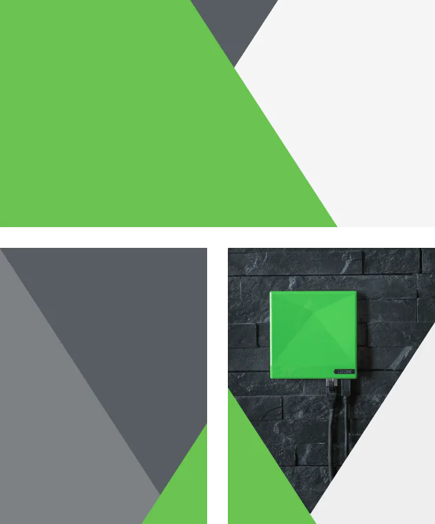

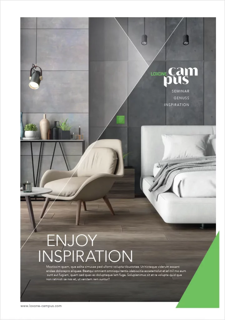
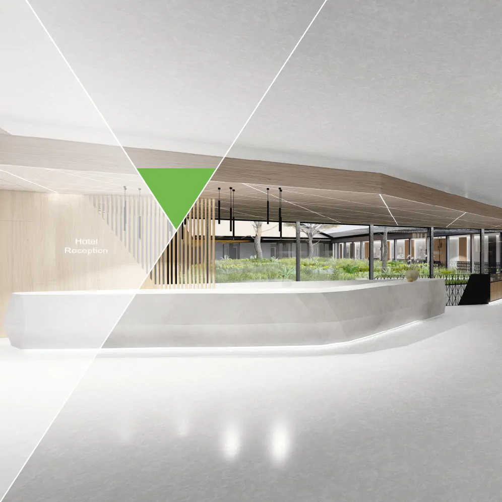
The trilogy
The trilogy is an interpretation of the edge-emphasized Loxone design language – just like the Loxone Campus logo.
It takes the triangular look of the 33° angle and transforms it into an easy-to-use, highly customizable and recognizable branding tool.
A trilogy contains 2 to 3 levels (including the medium itself) that seem to overlap. It is intended that the levels touch each other.
One of the layers must represent the clear majority in the pattern, which can be achieved by the size or color scheme. In most cases, it will be the layers in the foreground.
The layers can contain a color or an image, but at least one of them must be in Mantis Green. Each layer may contain text, logos and/or slogans.
Important:
Do not change the angle of 33° and do not rotate the surfaces by 90°. Ensure that the layers are randomly proportioned and avoid layers of the same size.
Icons
Here are some symbols that you can use for your designs. The symbols can be used in the primary or secondary colors.
An icon can never replace a headline or an image. It can be just an extension, an eye-catcher or an accompanying illustration for your content.
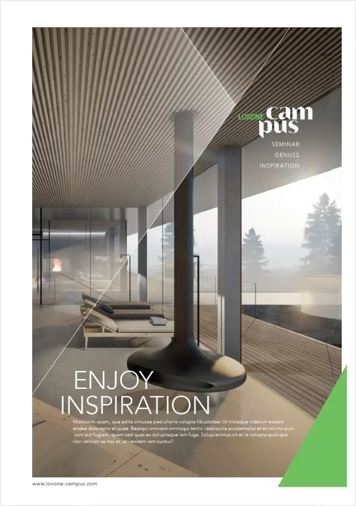
Best PRactices
Some examples of the correct positioning and combination of logo and slogan
Important: Always ensure there is good contrast between the logo and the background.